Non-Profit
Solution Recommendation
Overview
Client: A volunteer lead organization that exists to serve and educate outdoor enthusiasts, encouraging them to become respectful and responsible while in the outdoors. Their volunteers lead over 3,000 activities a year and they have over 7,000 members.
Challenge: Uncover what can be done to improve the member experience, define those areas for improvement and a create a plan for improving them that can be presented to their board for approval.
Timeline/ Process: Planned to be 4-5 weeks ended up being 3 months due to availability and general end of year busy-ness of everyone on the team. We didn’t define a process, although we mostly followed my UX process.
Team: 2 Stakeholders (Marketing Director and Membership Director), Business Analyst, Solution Architect, Project Manager, and Engagement Manager.
My Role: UX Designer
Why Now?
They had recently completed a technical assessment over the summer that had uncovered several areas for improvement and they wanted to make a plan for how to address those issues. Part one of the plan was to address issues related to the member experience looking specifically for ‘quick-wins’.
Research
We started the project with several subject matter expert (SME) interviews where they explained different areas of their site including membership, youth and adult education, and member events. We also interviewed people in finance and marketing. Through the interviews several themes seemed to pop-up around inconsistency with their site and member frustration in not being able to do what they wanted or needed to do. There were also specific areas of the site that seemed to cause the most frustration internally and externally (anecdotally at first, but eventually corroborated after surveying members) which included the calendar of events, signing up for a class, and joining/renewing as a member.
Their Key Needs
Attract a more diverse base of users
Refresh the look of the website
Blueprint for next-steps
Updating to modern technology framework
Make everything on the site easier to find
Plan
I created a set of survey questions to ask current members to help discover underlying issues the user base has with the website and that I could use in crafting personas. Questions included: basic/demographic, goals, and pain points. I also helped review the survey which included more questions than just my own to help with wording specifically. Because of timing this wasn’t sent out until 2 months into the project, which was part of the reason the timeline was extended. The survey had close to 700 responses out of 7,000+ members which was a good response rate and left us with some really good data.
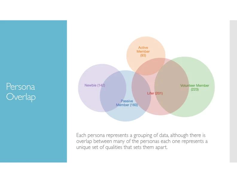
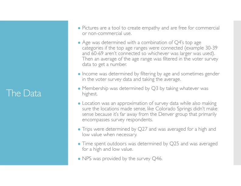
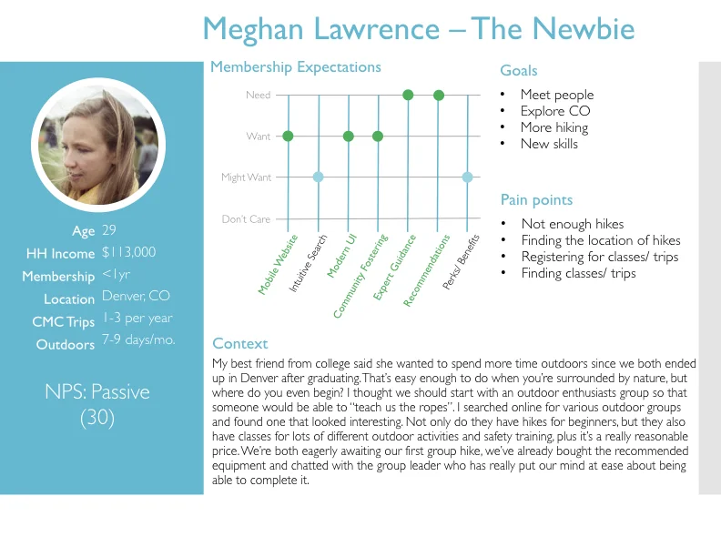
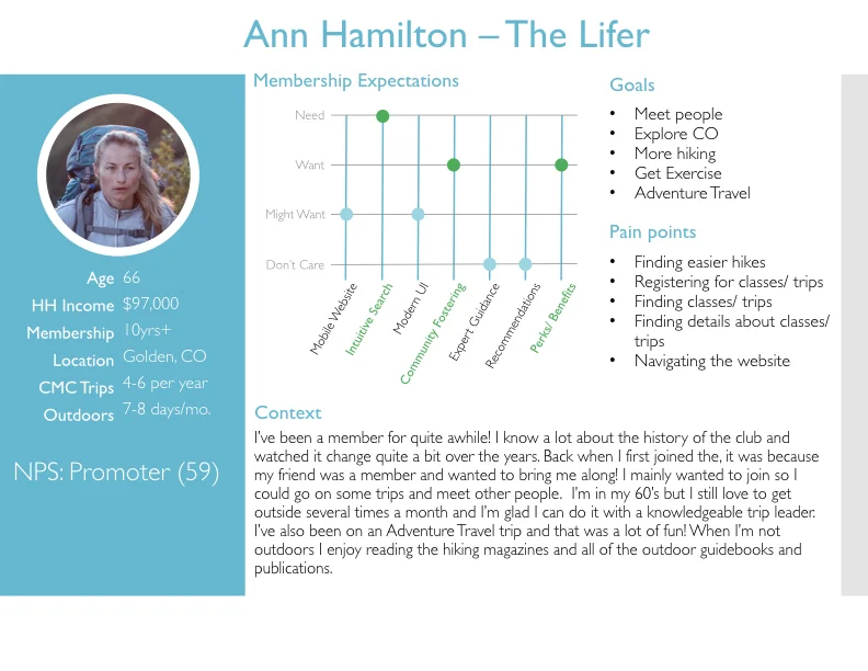
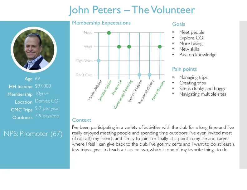
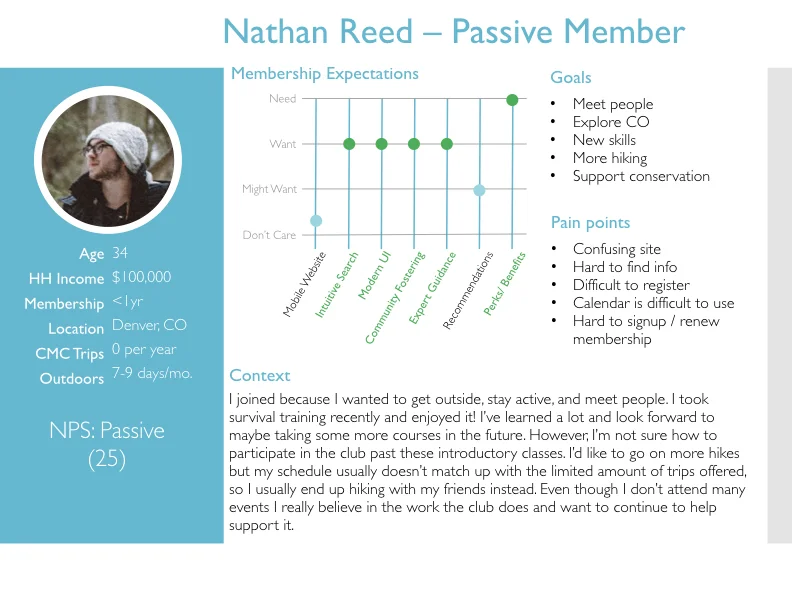
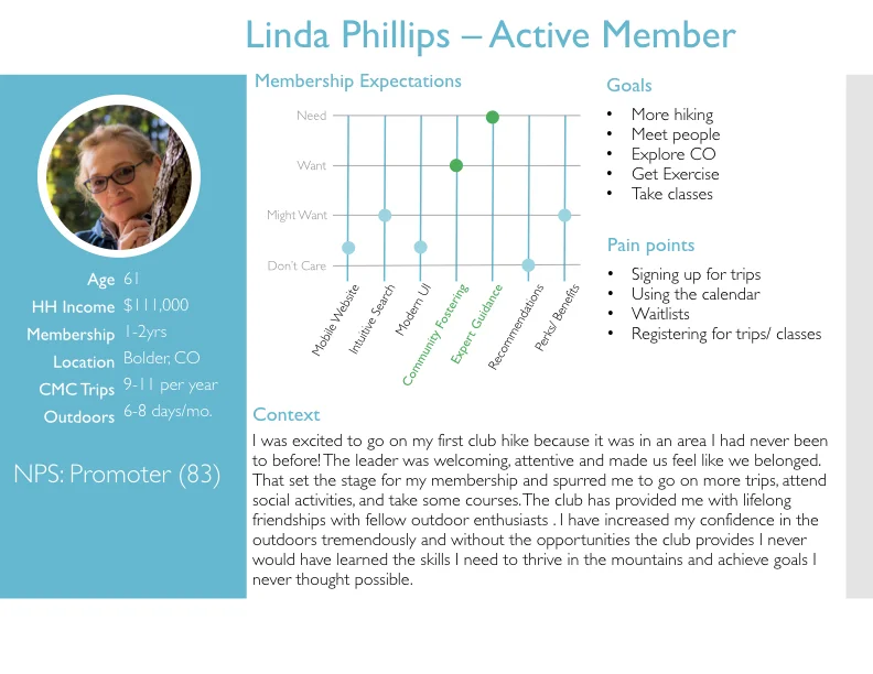
I created personas to help align stakeholders and their board of directors on the best ways to help their members. The personas were created based on the new survey data and some slightly older tax data they had purchased. I used Survey Monkey to parse the survey data and PowerBi to parse the tax data. We were able to identify 5 unique personas (Newbie, Lifer, Active Member, Passive Member, and Volunteer Member) after initially finding 3, then creating 7, and then archiving 2 of them (because there wasn’t enough unique data, but they may want to use them in the future).
Design
I preformed an expert review (also known as a heuristic evaluation) where I used a set of standards to review their current website and look for ways to improve it. I adapted my set of standards from Jakob Nielsen’s Usability Heuristics to be more in-line with the goals we had defined and because I wanted them to be easier to digest since the final audience would be the board of directors.
One of the recommendations that came out of the expert review was a card sort, which is a technique for helping define a navigational structure for a website that matches the way users expect it to be. Because of budget and time constraints I wasn’t able to perform this for them, but provided a detailed card sort guide on how they could do it themselves.
I created a set of sketches for the minimum viable product (MVP) before I went to whiteboard with stakeholders. After the white-boarding session I made wireframes to help solidify the understanding. I was important to do high-fidelity wire-frames so the board of directors would have a reliable vision of what their site could look like. I created the wireframes in Sketch using Material design as a baseline and exported them as a PDF for easy sharing and linking with other documents the team created.
Feedback
I held a white boarding sessions while I was in town to help solidify the understanding of what a MVP would look like and align expectations. I also held a design review for the MVP, and made a couple of small changes based on the feedback I received during it.
I held several persona reviews to discuss the survey data, the personas and what I needed from the stakeholders. These sessions ended up being really valuable for me as I was creating the personas, but also for the stakeholders because they were able to watch as the persona were modeled after their data.
Deliverables
5 Personas
2 Archived Personas
1 Expert Review of their current site
1 Set of Survey Questions
11 Wireframes for an MVP
1 Card Sort Guide
Outcomes
We addressed all the concerns members had that were technology related and provided a blueprint for next steps with a list of recommendations they could do themselves, including a card sort to understand the issues their members were having navigating.
“Thanks for your work on the user personas! It was really helpful to see all our survey data personified.”


