Multi-Portal
Consolidation
Overview
Client: A provider of innovative tools for monitoring and managing behavioral health, chronic pain and criminal justice cases. Providing pharmacy, clinical laboratory, and analytic tools to enable actionable information to protect prescribers, improve patient outcomes, and contain costs.
Challenge: Consolidate 4 existing portals into 1 and update another portal in parallel, to have the same look and feel. Then implement single-sign-on (SSO) for users to access another 2 portals.
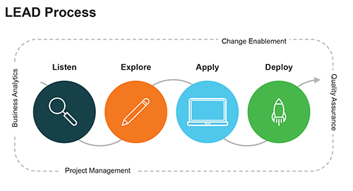
Timeline/ Process: ~5 months using Agile and a newly implemented L.E.A.D. process
Team: 4 stakeholders(3 Directors and the CIO), Scrum Master(who also acted as PM & BA), 2 Architects, 1 Engineer, 3 Developers, 1 Systems Analyst (who acted as a jr. Designer).
My Role: UX Designer
Why Now?
They were supporting 14,000+ users belonging to 4,000+ clients across 7 different portals each with its own limitations. There were multiple teams across different departments providing internal support depending on which portal(s) the client was using. The sales team was having a hard time picking the right portal or set of portals for prospective clients as well as selling the idea of using more than one. They needed to provide a more effective, inclusive, data centric application, and they wanted to own it instead of relying on 3rd party companies when they wanted to make updates.
Research
The project started about a week before the official kickoff and we used the time to review each of the existing portals one by one to get an understanding of the different features each one provides. We interviewed subject matter experts (SMEs) and stakeholders to understand their pain points and what they were hoping this project would accomplish.
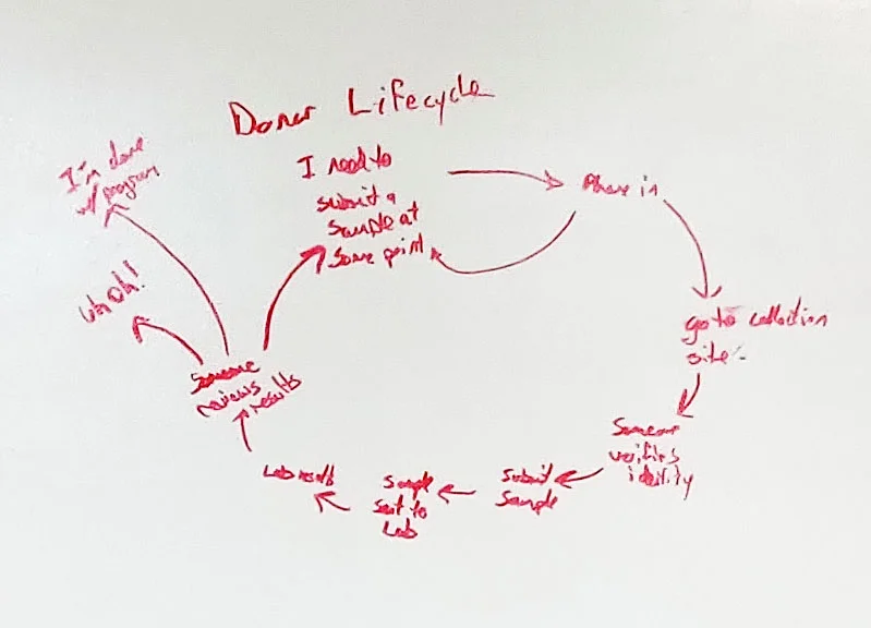
We had an in-person 2 day kick-off/ workshop where we white boarded user flows and process flows. I reviewed a few different frameworks with the development and architect team that would help quick start the project including Bootstrap, Material, and Ant. We then used the rest of the time to get as many answers as possible and make as many decisions as we could .
Their Key Pain Points
Inconsistent branding and styling
Capable of implementing new products
Modern technology
SSO for users
Simplicity for their clients when they decide to join
Less training for their clients because it’s user friendly
Plan
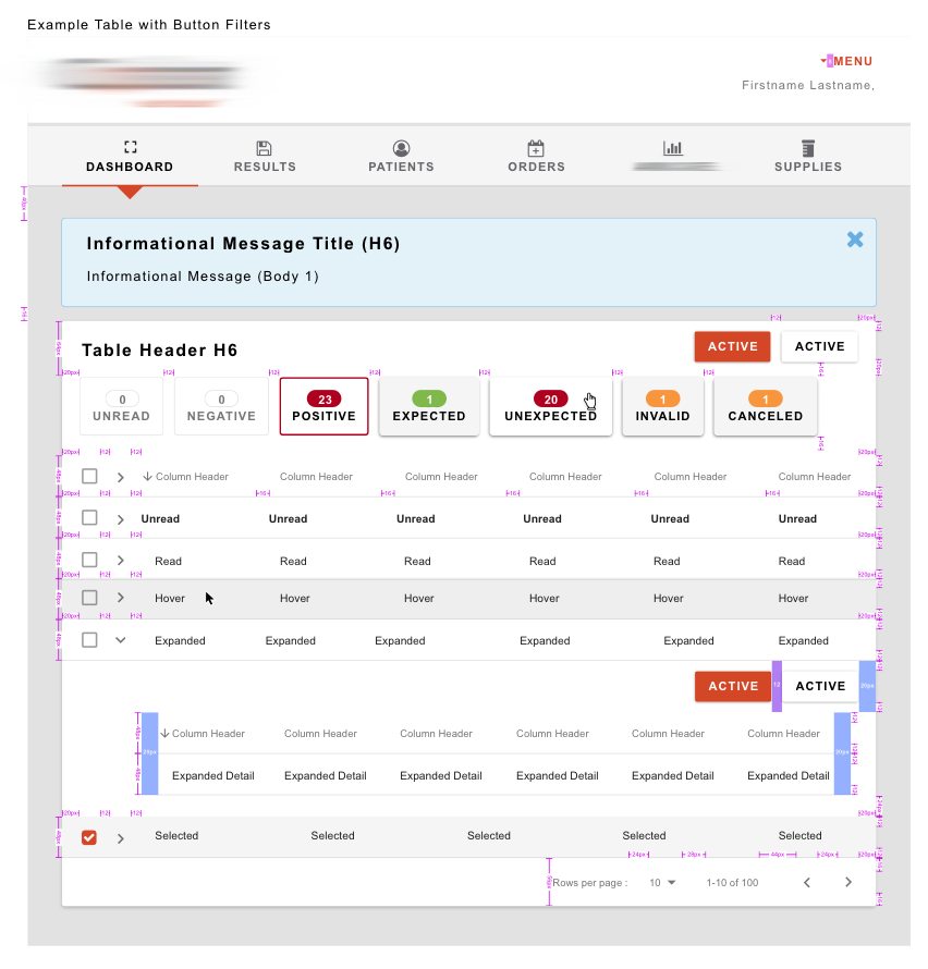
I created an iterative style guide using atomic design principles and Material as the backbone, but I modified and added elements as necessary. We decided to use Material design because both sets of development teams were comfortable using it, it had good support, and it had lots of documentation which I hoped would help limit the amount of time spent creating the style guide. Unfortunately, that was not the case, because I was asked by the CIO to recreate everything so there wouldn’t be any confusion for the developers or stakeholders.
As a supplement to the style guide I also created CSS and HTML, for nearly every element in the style guide to help the developers who were using 2 different development stacks. And because it was iterative I also created a change-log so that everyone knew what things were changed and could easily check if they had the latest version or not.
Design
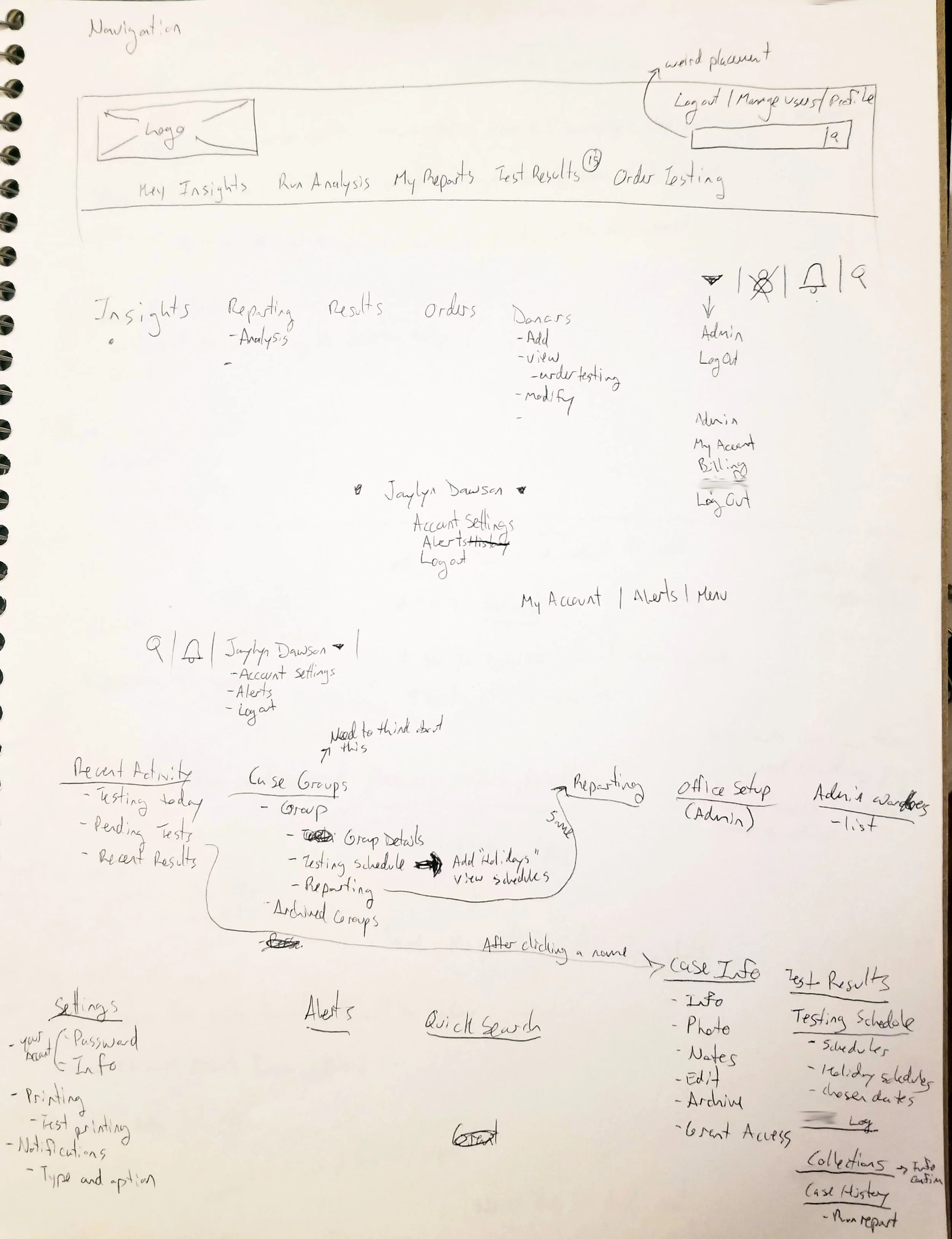
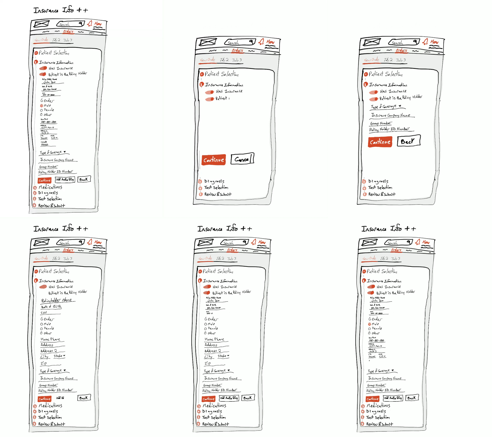
The most important thing the stakeholders wanted to see besides the style guide was the navigation. I began sketching out how the different pages and groups of activities a user could do would connect as soon as I got back from the kick-off. Initially I sketched most ideas in a notebook, but as the project continued I started utilizing Procreate on my iPad to get a slightly higher fidelity out of the sketches before doing the wire-frames.
After sketching the navigation I began wire-framing it in Sketch. As I created assets I added them to the style guide, ultimately the navigation went through over 10 revisions right up until I was rolled off the project. After the navigation I began wire-framing the dashboard and the results screens for both portals in-tandem with updating the style guide. A couple of months into the project they brought in an analyst to act as a jr. designer for one of the portals because I couldn’t keep up with the wire-frame demands of both portals at the same time. Ultimately, a lot of the wire-frames overlapped, but having that separation helped the developers focus on their own portals. I transferred the Sketch artifacts to UXPin twice, the first time to help the jr. designer with what she was working on and the second time to do a knowledge transfer as I rolled off the project.
Feedback
Each wireframe went through dozens of design reviews and iterations because we reviewed both with the team and separately a group we called the secondary stakeholders (a group who was very interest in the project, but didn’t have the time to commit to being a team member). After each review I incorporated the feedback until we reached a consensus which was important to this client.
While the jr. designer and I worked together I helped to critique the designs to help make sure they were aligned with the style guide and followed standard design patterns (ex aligned to a grid, defined hierarchy of information, etc).
Deliverables
1 Iterative style guide based on Atomic Design principles and Google’s Material design
1 CSS file to better define the style guide components
1 HTML file to help apply the style guide components
1 Change-log
15 Sketch Wireframes
100+ Sketch Symbols
1 Sketch Library
Outcomes
We were able to bring new capabilities to their business including the ability to add to their product list like their new Risk Assessment. They have a consistent look and feel to their products so their customers have brand recognition and less confusion. And all their users are able to get from one portal to another using SSO without needing to remember separate login details.
“I’ve learned a lot from working with you and appreciate all you have done.”
